Saturday, 1 June 2013

Cambodia, Phnom Penh: Cheoung Ek Killing Fields

Cambodia, Phnom Penh in the middle of May; 38 degree weather slaps layers of sweat onto my face, before it trickles down my rapidly darkening shirt.

Having spent the last two weeks running from one corporate event to another, I figured it’d be a good idea to get away from skyscrapers and concrete, and spend some time on the other side of the world. After some thought, Alex and I decided the other side of the world would be Cambodia, home to human atrocities, monumental temples, and happy pizza.

Our first stop: a merry jaunt down the killing fields, followed by a hop and a skip to the Toul Sleng holding prison. Until recently, I only had a very vague notion of what Cambodian went through under the Khmer Rouge, I mean sure, people talk about it, but it’s not the sort of thing one actively goes out looking for, unless you’re writing a paper on human genocide. So while we were merrily scammed by our tuk tuk driver on the way to the killing fields, we did a little research into the regime.

The Khmer Rouge was the Communist Party of Kampuchea, a political party which ran Cambodia (then named Kampuchea) from 1975 to 1979. I’m not particularly interested in their ideology, other than it being xenophobic and insular.

In 1975, the population of Cambodia was approximately 7mi. In 1980, the population was 6.5mi. Various studies estimate the Khmer Rouge was responsible for the deaths of between 1.4mi to 2.2mi Cambodians.


By and large the leaders of the genocide have walked free. Most went on to live long and healthy lives, and have only recently apologized inMay 2013. They still maintain they were doing the right thing.

Little from the original killing fields is left standing; most of the buildings were razed for scrap material and the major building is a 12-story high mausoleum and a single story museum, which houses images of the camp. 

Visitors get a Walkman with a programmed audio tour, chock full of survivor testimonies, and disturbing stories.

Creative deaths were a recurring theme in the tour. When bullets were scarce, people were executed by their captors with farming implements, DDT, and in a few cases, sugar palm. The stems of the sugar palm are lined with serrated bark edges, sharp enough to cut through human skin. So captors, presumably dissatisfied with conventional means of death and with a lot of time on their hands, dragged the throats of prisoners across the serrated stems of the sugar palm. The edges themselves are sharp, but short, so I imagine it would take quite a few tries before the gash was large enough to be fatal. Like I said, they had time.

Another is the baby tree. Babies and toddlers, being conveniently sized, were brained against a particular tree in the compound. There’s nothing really imaginative about this, just brutishly cruel.

Baby tree, sugar palm, shudder.
The only other item that stood out to me was the Buddhist stupa, which houses more than 5000 skulls in the lower 7 levels, while the upper 5 levels house the ribs and other assorted bones. It stands out in an open field, stark, imposing, and severe, almost like a morgue.

Buddhist stupa, 12 floors of bones

Next merry monument - Toul Sleng Genocide Museum

Saturday, 4 May 2013

Bukit Timah in the dark


At 163m above sea level, Bukit timah hill is the tallest point of Singapore. Which is a bit like saying Tampines Rovers is the best team in the S-league; it doesn’t mean much, and no one really cares, save for the small group of middle-aged foolhardies stomping along the dirt trails at 2330hrs.

Surrounding Bukit Timah Hill is Bukit Timah Nature Reserve, which at 2030hrs, is pitch dark. Black doesn’t begin to describe the depth of how dark it gets. If you hold your hand within breathing distance of your face, you wouldn’t see it, making it a great hiding place for a local cryptid.

I don’t see why the National Tourism Board doesn’t include the Bukit Timah Monkey Man as one of the attractions in Bukit Timah Nature Reserve, it’s worth good money in certain circles. Of course people will never see one - it spends all its time in hiding from public view, much like post-election politics. And much like politics, it’s not about facts, it’s about hype.

Reality tends to hit much harder, and at 29 degree Celsius, and 91% humidity, we were drenched in the foul reality of sweat-drenched bodies, glued on shirts, and moist underwear. More than a few ankles landed awkwardly, which considering you’re in a forest of tree roots, mud and rocks with only a headlamp to light your way, is the reality of midnight treks.

Unlike the guy in the video, we were a group of six, which was just as well, because being in the middle of a Bukit Timah alone at night is pretty eerie, although nowhere near as creepy as Aokigahara at the base of Mount Fuji (dead bodies in that link, informed clicks please). Maybe that’s why the Oxfam Japan 2013 route doesn’t actually have Fuji as part of its route, or maybe there are plans to keep hikers off its beloved trails because those damn hikers keep dying.

It’s good to be trekking. 

Thursday, 18 April 2013

Man of Steel

Third trailer is out. I am optimistic, not just because visually it's got Zack Snyder's name on it (remember 300? Yeah, now recall Watchmen. Meh.) but because you've got Goyer-Nolan behind the scenes, working their magic on the script. And the script is the blueprint for everything embedded in the movie.

Goyer-Nolan scripted Batman Begins, so their track record for producing good first arcs is certainly a good one. And just for pumped-up kicks, take a look at the IMDB box office stats for Batman Begins: production cost is an estimated US$150m. As at 19 July 2012, worldwide gross is US$374m. Production time started in March 2004. From March 2004 till July 2012, is about 8.3 years. Works out to about an annualised 11% return which is a pretty awesome investment, from a gross numbers point of view. Net numbers likely look very different. Of course, let's not talk about the labour issues inherent in the film industry.

Man of Steel is set to hit the screens worldwide 14 June 2013.

Tuesday, 16 April 2013

Working out with Jim Rogers

It's not everyday I get to make Jim Rogers sweat with my questions. Or in this case, he was getting his cardio by simultaneously being interviewed, while riding his exercise bike.

Constipated and happy at the same time.

Sunday, 17 March 2013

EM Equity three-way: Aberdeen v First State v JP Morgan


There’s been plenty of interest in the JP Morgan EM Opportunities fund. Inevitably, it’s going to draw comparisons with the two bigger GEM funds out there from First State and Aberdeen. So as an academic exercise, I figured it’s worth comparing the performances of all three.

Richard Titherington, the face of JP Morgan EM Opps, is listed as the manager since October 2009. So examining the time period of end-Sep 2009 to end-Feb 2013 gives about 3yrs of data to play with, with a rolling 12-month timeframe. to be fair, 12-month returns come with quite a bit of market noise, but bearing in mind I’m dealing with 3 years of data, it’s probably a sufficient, if flawed (entirely mine), start.


data: Lipper, in USD terms, dividends reinvested

The two charts above say that the fund does well across the ups and downs of the three years that Titherington has been managing the fund. Most of the time, the performance beats the market, and when it does, it’s by a bigger margin than when it doesn’t.

Performance alone says nothing about how he does it, neither does it say whether he’ll repeat this in the future, which are arguably the two more interesting questions. The next question then is how it compares against Aberdeen and First State GEM funds. 
data: Lipper, in USD terms, dividends reinvested
First State GEM leaders is a defensive machine, with a larger margin of outperformance than JPMorgan EM Opps on the downside. It does less well in stronger-than-average bull markets, compared with JPM EM Opps. Still…a clean sheet in down markets is a tough act to follow, unless the fund in question is one Aberdeen GEM fund.

Defensively, Aberdeen rivals First State GEM, with a clean sheet in down markets. On the upside, Aberdeen GEM in the past three years tends to beat the market, but relative to the other two funds, by a smaller margin. Again, clean sheet = tough act.

So from an investor’s point of view, the question of which fund to choose boils down to whether one is looking for a fund that performs well in up markets and down markets, or one that performs well in up markets, but better in down markets. All three are solid performers, with Aberdeen and First State holding
 an edge when markets head south.

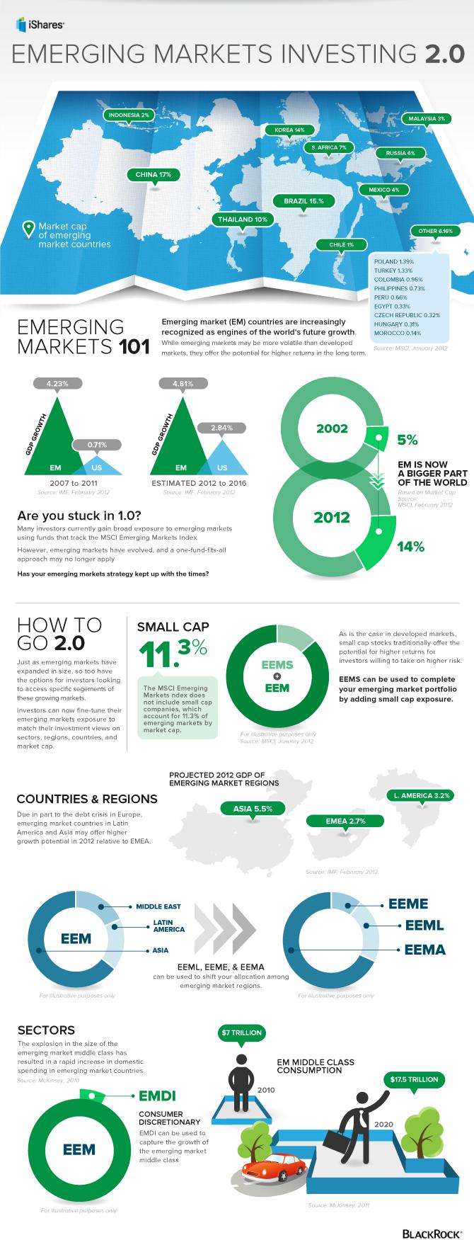
Clearly, there’s a lot of interest in the EM story, and a lot of people are filling up the space, which is great for choice. But I reckon there will be more thematic funds coming up. We already have a few EM small cap funds in the space, infrastructure spending is big in India, and China’s consumption story has already inspired a consumption-themed fund or two.

Of course, so much interest in a relatively immature market does raise caution in several better known bears. Andy Xie for instance, has started writing about a BRIC bubble:
‘Whenever there is a hot concept like BRIC, there is a bubble. There has never been an exception.’

Thursday, 7 March 2013

While I was away...

So after disappearing for a good month or so, I resurface to find myself completely immersed in the slightly unfamiliar waters of the broader fund universe. To be exact, over 109,000 funds in 57 registered for sale (RFS) countries, according to Lipper.

I find it rather exciting, although not as exciting as a good WWE match. It's quite a learning curve, which is a phrase I wouldn't mind carved on my gravestone, not so much as a lament for the relentless pace of change than a concise summary on a punctuation mark.

But time spent navel gazing, which I'd much rather not do on a public blog, is time better spent ruminating on how to write better articles, or at least more enlightening ones.

There's a small debate growing about long-form journalism, questioning the decline in 2000-word articles in heavyweight publications like the New York Times, Washington Post, Los Angeles Times, and the Wall Street Journal. First up this is obviously a US-centric view of the publishing world, and I don't think you'll find many people worrying over the same question in Singapore. After all there are more important questions to ask, like, 'Dude, where my car?'

Although, if the data from MAS is any indication, there's enough to pay for many cars. Singapore residents as a whole, are pretty damn flush with cash. Approximately S$500billion worth sits in the banks. That's about 10 million cars, worth S$50k each.

data: Monetary Authority of S,ingapore 
URL: https://secure.mas.gov.sg/msb-xml/Report.aspx?tableSetID=I&tableID=I.4

Monday, 14 January 2013

Tracking Portfolio Performance


I like knowing things. But sometimes I lack the native speaker’s grasp of a language to be fluently knowledgeable in matters foreign to my still-evolving mind. So I’ve been dragging my feet over calculating my portfolio’s return, because I’m not entirely confident of my math.

Which means I’m either going to make a passable effort, or fail spectacularly. Better to make the effort and be a good sport however it turns out.

So for the past few months or so, I’ve been tracking my daily portfolio value, by logging into my FSM account – why – so I can track my portfolio’s daily return – why – so I can compare my portfolio’s return with a risk-free rate of return: a certain 3.5% p.a. courtesy of the CPF-OA interest rate.

If my portfolio of investments fail to beat the risk free rate of return, then I’m just pissing away my time and money, and I’d be better off leaving my money in Singapore Government Bonds, which the CPF invests in. (On a side note, I found no info about the portfolio of the CPF monies i.e. which SGS Bonds they’re invested in…if anyone can point me in the right direction, I’d be grateful).

I thought calculating returns would be a simple task of calculating the difference between how much I put in versus how much I got out. Turns out, like many things in finance, it can get quite a bit more complicated if one so chooses.

Sure I can find out how much I made, but that’s not all there is to returns. I also want to know the magnitude of any positive/negative returns over a given period.

There are other limitations with a simple, 1-number measure of performance. That measure of performance, expressed in a formula is: (current value/initial investment)-1.

Firstly, it doesn't tell you which fund contributed to the portfolio’s performance. If a fund is losing money, I want to know about it, and whether it’s doing so because the market is crap in general or the fund manager has decided to dedicate his life to improving his golf handicap instead of generating returns.
Secondly, realized losses aren't captured. For example,

Say I held two funds from 2011 to 2012, with $1000 in each fund (Initial investment=2000, current value =2000, performance = 0%).
Two months later, one fund drops 50%, while the other remains constant. (Initial investment=2000, current value =1500, performance = -25%).
In a fit of anger, I realize my loss, selling all my units of that losing fund. (Initial investment=1000, current value =1000, performance = 0%).

Presto, I've no longer incurred a loss on my portfolio. This is problematic because it doesn't provide an accurate measure of the performance of my portfolio. (it hides the losers, while illuminating the winners. Survivorship bias anyone?)

So I’m left with the challenge of finding a way to track the performance of my portfolio, adjusting for various ups, downs, ins, and outs of its performance.
In the 1800s, the intelligentsia thought having heretics wear dunce caps would improve their intelligence. Sadly, neither intelligentsia nor heretics have matured much since then. (Source: http://commons.wikimedia.org/wiki/File:Scene_from_an_Inquisition_by_Goya.jpg)